Introduction
A travel frontend website acts as the visual and interactive layer of a travel platform. Its primary goal is to present destinations, services, and experiences in an inspiring way.
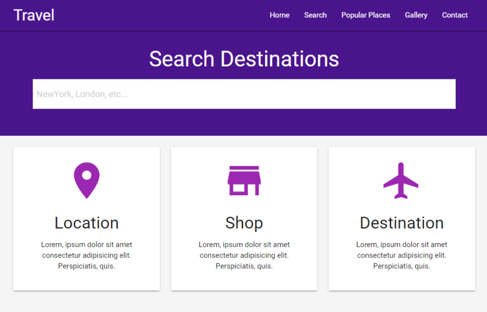
A travel frontend site is the visual and interactive part of a travel website that users directly see and interact with in their web browser. It focuses on providing travel-related information in an understandable, appealing, and user-friendly manner, including locations, tour packages, galleries, and navigation. The frontend focuses on design, layout, responsiveness, and user experience rather than databases or server functionality. It is a simple one page site project with responsiveness from small to large devices.
This travel frontend site is built using HTML5, CSS3, JavaScript, and modern UI frameworks such as Material Design. HTML5 provides the structure of the website, organizing content like destination sections, headers, footers, and navigation menus. CSS3 controls the visual appearance, including colors, typography, layouts, responsiveness, and animations that make the site visually appealing across devices. JavaScript adds interactivity, such as sliders, menus, smooth scrolling, and dynamic content updates, making the site feel responsive and engaging.
This type of travel frontend website is especially important for:
- Travel agencies and tour operators
- Destination promotion platforms
- Travel bloggers and content creators
- Booking and itinerary planning services

Core functionality
HTML5 in structuring
HTML5 forms the structural backbone of a travel frontend site by organizing content in a logical, semantic, and accessible way. It defines sections such as destinations, navigation menus, travel descriptions, highlights, and footers using meaningful elements. This clear structure helps search engines understand page intent and improves accessibility for assistive technologies. As a result, destination pages are indexed more accurately, and users experience better readability and content flow.
CSS3 for visual appeal and design
CSS3 transforms structured travel content into an immersive visual experience. It controls layouts, typography, colors, spacing, and responsiveness, ensuring the site looks polished across all screen sizes. Travel websites depend heavily on visuals, and CSS3 enables smooth transitions, hover effects, and balanced spacing that prevent clutter. Responsive design is essential, as most travelers browse on mobile devices and expect a seamless, visually rich interface.
JavaScript for interactivity
JavaScript adds life and interaction to a travel frontend site. It enables dynamic features such as dropdown navigation, mobile menus, image sliders, smooth scrolling, and interactive destination cards. These behaviors make the site feel fast, modern, and user-focused. When used carefully, JavaScript improves engagement and usability without overwhelming visitors, guiding them naturally through destinations, content sections, and calls to action.
Material Design framework for usability
The Material Design framework provides a consistent and professional UI system for travel frontend sites. It offers ready-made components like cards, buttons, and navigation patterns designed around real-world motion and depth. This consistency helps present complex travel information such as destinations, packages, and reviews in a clean, digestible way, improving usability while maintaining a modern, trustworthy visual identity.
Why this project matters?
This travel frontend project is significant because it captures the real-world online experiences of genuine people. People are searching for clarity, enthusiasm, and trust rather than code or frameworks when they hunt for travel inspiration. What transforms a casual visitor into an active explorer is a well-designed frontend. This project is particularly relevant in today’s travel-focused internet market because it focuses on just that experience.
Making the decision to travel is emotional. Long before they make any reservations, they envision locations, cultures, and experiences. This frontend project recognizes this and supports that emotional journey with simple layouts, eye-catching graphics, and seamless interactions. It offers destinations and material in a serene, organized, and welcoming manner rather than bombarding people with information. What distinguishes great travel websites from mediocre ones is the harmony between information and imagination.
From a learning and development perspective, this project is equally important. It demonstrates how core frontend technologies HTML5, CSS3, JavaScript, and a modern design framework work together in a practical, real-world scenario. Many beginner projects feel abstract or disconnected from real use cases. This one does not. This project mirrors the kind of interface users expect from professional travel platforms, making it highly valuable for portfolios and skill-building.
How to use the project?
- Download the project.
- Extract the source code.
- Set up an editor or IDE. (vs code, sublime text, atom)
- Open the project folder on the editor.
- Launch the project in the browser. (chrome, firefox)
- Use the project.
- Enjoy!
Explore this travel frontend project, study its structure, and use it as inspiration to build your own modern, responsive travel website. Apply the design principles, improve the user experience, and customize it to fit your vision.
If you are learning frontend development or building a portfolio, this is the perfect starting point take the next step and start creating today. Click the download button below to get the source code for this project.


i enjoy reading this great article, i have shared it many times on my website and started following you, Do you post more often ?? i am the owner of https://webdesignagenturbayreuth.de/ a webdesign agency in bayreuth Germany, webdesign agentur bayreuth, you can link up if you are interested. Thank you