
Introduction
Mobile tab nav is one of the most widely used navigation interface patterns in modern mobile web and app design. This blog focuses on mobile bottom tab navigation built using JavaScript.
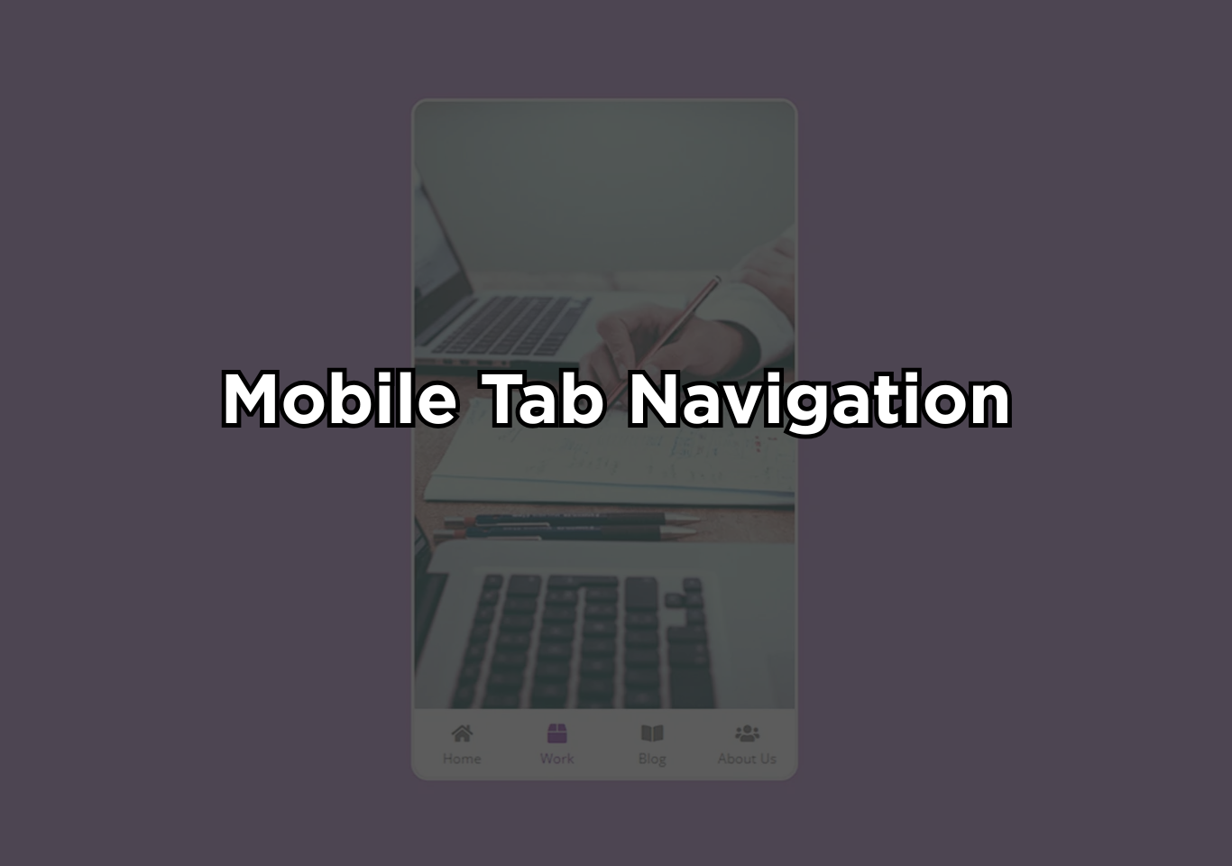
Mobile tab nav bar is a fixed bottom navigation bar placed at the bottom of a mobile screen that contains multiple tabs representing primary sections of an application or website. ach tab typically includes an icon, a label, or both, allowing users to understand and access features quickly. Unlike hamburger menus or hidden drawers, bottom tab navigation keeps essential options visible at all times.
This design choice minimizes friction and ensures faster navigation, especially on small screens. This navigation style is specifically designed for mobile devices, where screen size, thumb reach, and speed of interaction are critical factors.
By positioning navigation controls at the bottom, designers reduce physical strain and make navigation faster and more natural. This is why many high-traffic mobile apps rely on bottom tab navigation for their core user journeys.
From a technical perspective, mobile bottom tab navigation is often enhanced with JavaScript to make it dynamic. JavaScript enables instant content switching, active tab highlighting, smooth transitions, and state management without reloading the page. This creates a fluid, app-like experience even in mobile web applications.
The popularity of bottom tab navigation comes from its proven usability benefits. Studies consistently show that visible, persistent navigation improves task completion speed, user satisfaction, and engagement. For applications where users frequently move between sections, this navigation model offers clarity, efficiency, and consistency.

Building the project
The mobile tab nav project is developed using HTML5, CSS3, and JavaScript, with each technology playing a clear and practical role. HTML is used to structure the layout, place navigation elements, and position images and icons on the screen. It forms the backbone of the interface and ensures that all components are organized logically.
CSS is responsible for the visual presentation of the mobile tab nav. It styles the navigation bar, controls spacing and alignment, and ensures the layout adapts smoothly to mobile screen sizes. Hover effects and visual feedback are created using CSS to make interactions feel responsive and intuitive. CSS is also used to design the mobile-friendly layout, keeping the navigation comfortable to use with one hand.
JavaScript brings the navigation to life. Each tab is connected using event listeners, allowing the interface to respond instantly when a user taps on a tab. When a tab is selected, JavaScript updates the active state and displays the corresponding content without reloading the page, creating a smooth and app-like experience.
Free, high-quality images from Unsplash are used to enhance the visual appeal of the project. Icons are added directly through HTML to keep the navigation clear and easy to understand. Google Fonts are included to improve typography and maintain a clean, modern look across the interface.
Where to use?
- Social media platforms for feed, search, create, notifications, and profile
- E-commerce apps for home, categories, cart, wishlist, and account
- Educational platforms for courses, progress, downloads, and settings
- Productivity tools for the dashboard, tasks, calendar, and profile
- Content websites for the latest posts, categories, bookmarks, and the user area
Why botttom tab nav work?
Bottom tab navigation works exceptionally well on mobile because it is designed around how people naturally use their phones, not how designers want them to. Most mobile users operate their devices with one hand, relying heavily on their thumb.
The bottom area of the screen falls directly within the thumb’s natural reach, making bottom tabs faster and more comfortable to interact with than top menus or hidden navigation drawers.
Another key reason for mobile tab nav effectiveness is constant visibility. Bottom tab navigation keeps the most important sections of an app or website visible at all times. Users do not need to open a menu, remember where options are hidden, or take extra steps to navigate. This reduces friction, shortens interaction time, and makes the experience feel effortless.
mobile tab nav also improves cognitive clarity. Each tab represents a core section, allowing users to understand the structure of the application instantly. Because the navigation does not change location or behavior across screens, users build muscle memory quickly. This consistency leads to fewer mistakes and greater confidence while navigating.
How to use this project?
- Download the project & extract the source code
- Set up an editor or IDE.
- Open the project folder in the editor. (vs code, sublime text, atom)
- Launch the program in the browser. (Google Chrome, Mozilla Firefox)
- Use the mobile tab nav.
- Enjoy & Share.
Ready to build a smooth, mobile tab nav experience that users actually enjoy using? Download the mobile bottom tab navigation project and explore how HTML, CSS, and JavaScript work together to create fast, intuitive navigation.
Customize the mobile tab nav, experiment with transitions, and adapt the layout to fit your own mobile projects. Whether you are learning frontend development or improving an existing design, this project is a practical way to sharpen your skills and create interfaces that feel modern, responsive, and user-focused.