Introduction
A furniture frontend site is a web project that focuses entirely on the visual design, layout, and user interaction of a furniture website. It is a web-based project and easy to use and implement.
A furniture frontend site is a web project that only works on the look, layout, and user interaction of a furniture website. It shows the part of the website that people can see and use right in their browsers. The main purpose of a furniture frontend site is to display furniture products in an attractive, organized, and user-friendly way without handling backend operations such as databases, payments, or user authentication.
This kind of website usually uses well-organized layouts, excellent photos, and easy navigation to display furniture collections, including couches, chairs, tables, beds, and décor pieces. The page structure is constructed using technologies like HTML5, CSS3 manages styling and layout aesthetics, Bootstrap guarantees responsiveness on various screen sizes, and JavaScript with jQuery adds interaction like sliders, hover effects, and smooth scrolling.
Businesses and designers may showcase their corporate identity, increase user engagement, and make a good first impression with the aid of a furniture frontend website. Additionally, it is frequently utilized for design prototypes, UI/UX practice, student projects, and portfolios. It is a good starting point that can be expanded into a full furniture purchasing website by incorporating backend technology, even though it lacks eCommerce functionalities.

Core technologies used
HTML5
The furniture frontend site’s fundamental framework is provided using HTML5. It is used to clearly and semantically arrange material, including navigation bars, banners, product sections, categories, newsletters, and footers. The use of appropriate HTML5 elements makes the website easier for search engines and browsers to comprehend. Additionally, this structure guarantees that the content is rationally organized for consumers and enhances accessibility.
CSS3
The overall look and visual style of the website are handled with CSS3. It regulates the layouts, animations, fonts, colors, and space used in various sections. In this project, CSS3 improves scrolling sections, adds hover effects to product images, and helps create a sleek and contemporary furniture layout. Comprehensive styling guarantees that the website has a polished, eye-catching, and uniform appearance on every page.
Bootstrap
Bootstrap is used to build a responsive and mobile-friendly layout. Its grid system helps arrange product cards, banners, and sections neatly across different screen sizes. Bootstrap components also simplify the creation of navigation menus and responsive sections. By using Bootstrap, the website automatically adapts to desktops, tablets, and mobile devices, which improves usability and provides a smooth browsing experience.
JavaScript
JavaScript gives the furniture frontend site dynamic behavior and engagement. Sliders, buttons, menu interactions, and section-based scrolling behaviors are all controlled by it. Instead of making the website feel stagnant, JavaScript makes it feel responsive and interesting. By enabling more seamless navigation and improved control over the visual components shown on the screen, these interactions enhance the user experience.
JQuery
By simplifying DOM manipulation and event handling, jQuery streamlines JavaScript. Animations, hover effects, fluid scrolling, and interactive user interface components are its primary uses in this project. Because jQuery uses less code to accomplish these effects, development is quicker and easier for novices. It improves the furniture website’s overall gloss and responsiveness.

Building the project
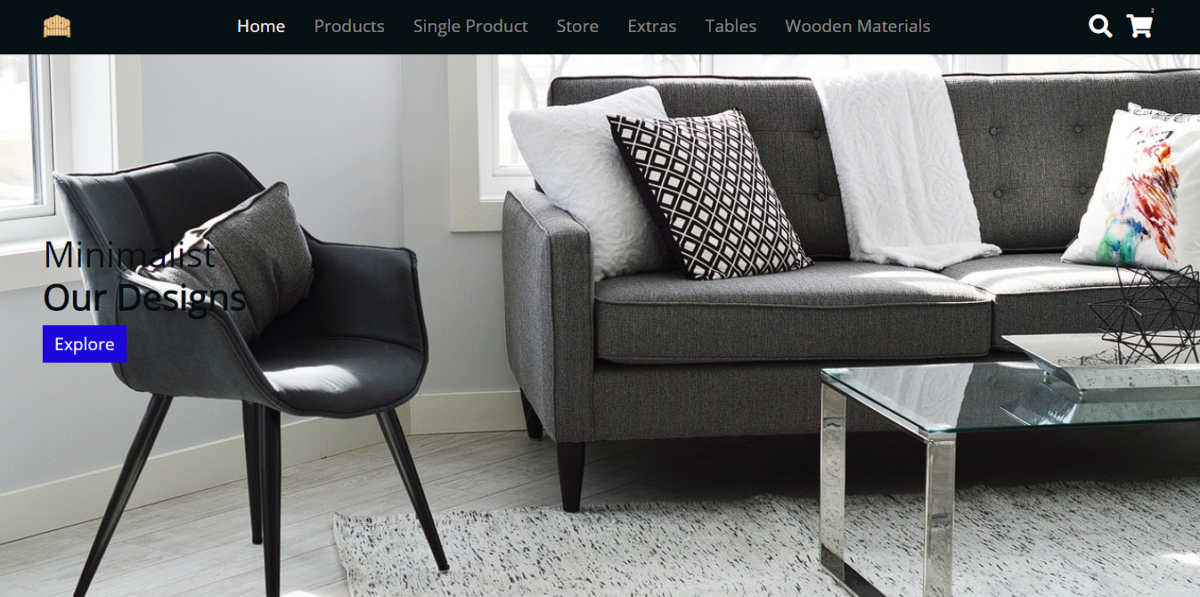
The project is designed with a clean and modern layout that focuses on user experience and visual clarity. Right below the navigation bar, a prominent banner section features engaging text and a call-to-action button. This banner immediately introduces the store and guides users toward exploring the products. As you scroll down the page, multiple sections appear, including product categories and featured furniture items. These sections are arranged to make browsing smooth and intuitive. A newsletter subscription area is also included, allowing users to sign up and receive updates about new arrivals and featured products. This helps the store stay connected with visitors even after they leave the site.
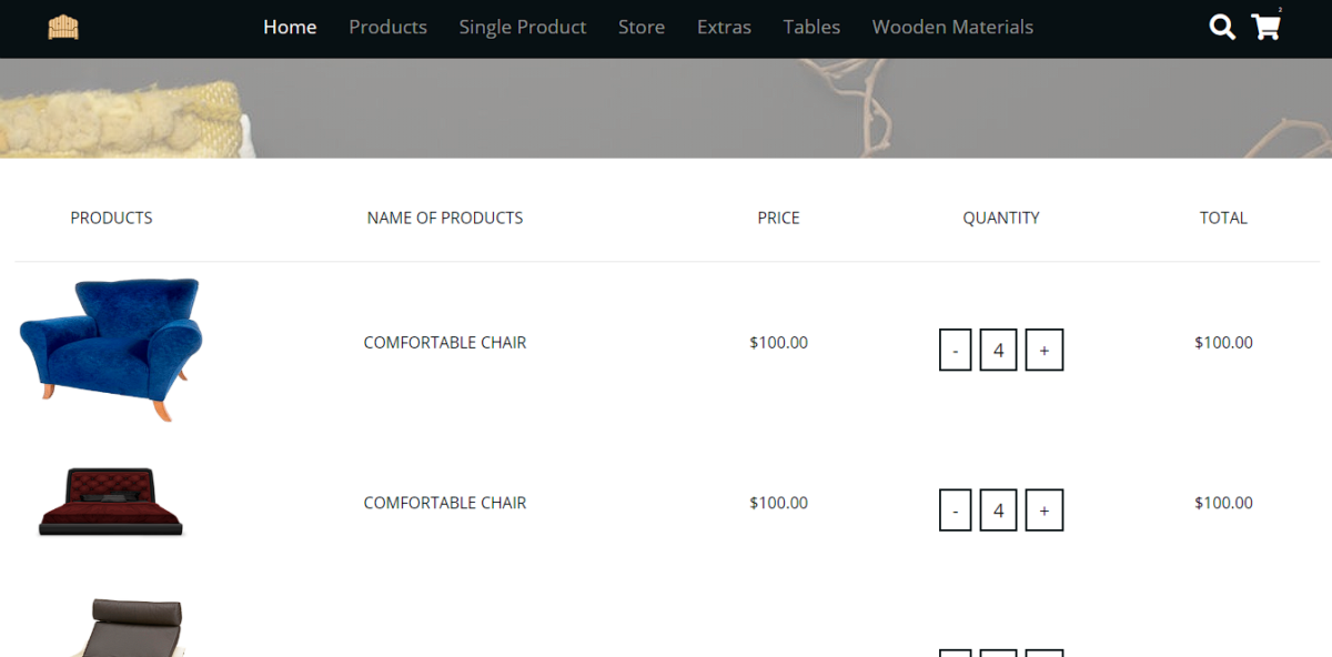
The footer section contains essential information such as shipping details, social media links, and contact information. The store uses a sample brand name, Wood Store, to simulate a real furniture business and create a realistic project feel. The product page is kept simple and focused, displaying furniture items along with their categories. Product images include hover animations that enhance interactivity and visual appeal.
A checkout option is available in the store menu for navigation purposes, while the single product page highlights one item on sale in detail. The project uses Google Fonts via CDN, with a clean sans-serif font for better readability. Extensive CSS styling is applied to achieve a polished look. Overall, this project is practical, beginner-friendly, and ideal for learning
How to use this project?
- Download the project.
- Extract the source code.
- Set up editor / IDE. (vs code, sublime text, atom)
- Open the project in the editor.
- Execute the project code on the browser. (google chrome, Mozilla Firefox)
- Use the project
- Enjoy!
Download the project, explore the layout, customize the design, and use it as a foundation to strengthen your frontend development skills. Perfect for portfolios, college projects, and real-world practice, start building today and showcase your creativity with confidence.
FAQs Section
1. What is a furniture frontend website?
A furniture frontend website is a user interface–focused web project that visually presents furniture products using design and interactivity without backend features like payments or databases.
2. Which technologies are used in this furniture website project?
This project uses HTML5 for structure, CSS3 for styling, Bootstrap for responsive layouts, JavaScript for interactivity, and jQuery for smooth UI behavior.
3. Is this furniture website responsive?
Yes. The website is fully responsive and adapts seamlessly across desktops, tablets, and mobile devices using Bootstrap’s grid system.
4. Does this project include eCommerce functionality?
No. This is a frontend-only project. It does not include shopping carts, user login, payment gateways, or database integration.
5. Is this project good for a portfolio?
Absolutely. It demonstrates responsive design, UI/UX principles, modern frontend tools, and real-world website structure.


