Introduction
Natours is a modern frontend website designed to showcase outdoor tours, adventure packages, and travel experiences in a visually appealing and performance-optimized manner.
Natours is more than just a frontend site; it demonstrates what modern web development can accomplish without backend code. Natours is a lightweight, visually appealing, and fully responsive tour-based web experience using HTML5, CSS3, JavaScript, Bootstrap, Material CSS, and other modern frontend technologies. The Natours site interface focuses on speed, aesthetics, responsiveness, and user engagement. Natours does not perform backend operations, such as those found in full-stack applications.
It emphasizes clean design, component-based UI structure, smooth animations, and intuitive navigation to provide users with a seamless browsing experience. Natours stands as a showcase of how powerful a frontend-only architecture can be when executed with control and accuracy. It leverages HTML5, CSS3, JavaScript, Bootstrap, Material CSS, and other frontend frameworks to deliver a polished and professional travel website experience.
Natours is a tour-based website built entirely with frontend technologies that features sections like.
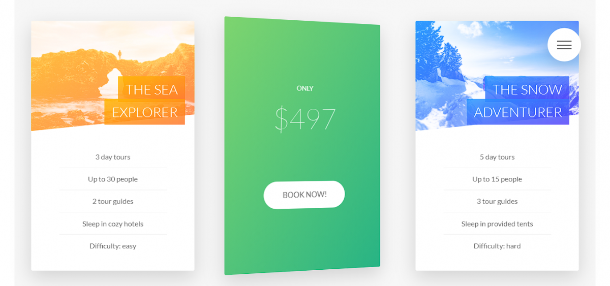
- Tour listings with videos
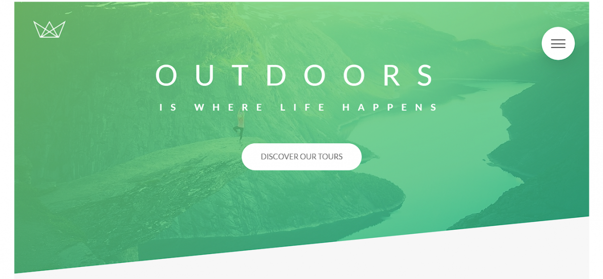
- Feature highlights with backgrounds
- Pricing/tiers &Testimonials
- Contact forms
- Interactive UI elements

Core Technologies
HTML5
HTML5 is the structural foundation of Natours’ frontend site, describing how material is arranged and interpreted by browsers. The inclusion of semantic components like as , , and enhances the readability, accessibility, and SEO performance of a website. These tags assist search engines comprehend the purpose of each site segment, resulting in higher rankings and clearer indexing. HTML5 also provides multimedia without the need for plugins, making it a crucial component of current web design. Natours uses semantic markup to ensure a consistent hierarchy and layout across all devices.
CSS3
CSS3 controls the Natours website’s visual look, layout structure, and design polish. It supports responsive grids, configurable box models, gradients, transitions, shadows, and complex animations to provide a seamless and immersive user experience. CSS3 also allows media queries, which automatically modify layouts for mobile, tablet, and desktop devices. This guarantees that the tour cards, hero photos, and sections are displayed correctly on all devices. With current properties such as transform, clip-path, and transition, the site achieves professional-level aesthetics without relying on heavy scripts.
JavaScript
JavaScript adds interactivity and behavior to the Natours frontend website. It controls animations, dynamic content changes, mobile navigation toggles, form validation, and micro-interactions to increase user engagement. The new JavaScript standard, ES6+, has better syntax, modular code, arrow functions, classes, and enhanced speed. These features allow developers to create more readable and scalable scripts. Natours uses JavaScript to enable seamless transitions, scroll-triggered animations, and responsive UI components that feel intuitive. It changes the website from static pages to an interactive, user-friendly experience.

Bootstrap
Bootstrap is a frontend framework that includes a responsive grid system, prebuilt components, and utility classes, allowing Natours to keep the layout consistent across all screen sizes. It simplifies spacing, font, and alignment, allowing developers to create interfaces faster. Bootstrap’s components, including navbars, cards, buttons, and modals, help to decrease development time while maintaining a professional and consistent appearance. Its mobile-first architecture ensures that content works fluidly across all devices. Bootstrap ensures clean layouts for hero sections, tour cards, and feature blocks on tour-based websites like Natours.
Material CSS
Material CSS implements Google’s Material Design concepts on the Natours website, adding depth, motion, clean space, and tactile elements. It emphasizes on realistic visual clues such as elevation, shadows, and surface layering to help users quickly understand the interface structure. Material components such as cards, buttons, input fields, and navigation bars give the site a modern, app-like appearance. When combined with responsive design patterns, Material CSS improves usability and visual harmony across several devices. The technique maintains uniformity while allowing for creative license within the defined design system.
Design Philosophy
- The site uses strong visuals, color contrasts, background images, and clean layouts to communicate a sense of adventure.
- With a majority of travel browsing happening on mobile devices, Natours prioritizes responsiveness from small to large devices.
- Travel websites tend to engage users with heavy imagery and structured typography.
- Because Natours is a frontend-based system, the loading speed becomes a major competitive advantage.
- Smooth animation guides user attention toward important features and improves engagement.
Benefits of Building a Natours
- Strengthens frontend development skills
- Builds UI/UX understanding
- Improves CSS mastery
- Encourages clean coding habits
- Creates portfolio-ready work
- Demonstrates knowledge of modern design frameworks
- Helps beginners learn without backend complexity
How to use this project?
- Download the project & extract the source code.
- Set up an editor or IDE.
- Open the project folder in the editor.
- Launch the program in the browser.
- Use the project.
- Enjoy & Share.
Are you ready to elevate your frontend talents from basic layouts to polished, professional experiences? Create your own Natours-style project today and discover how far clean UI, modern CSS, and intelligent JavaScript interactions can lead you.
Download the tools, examine the framework, and begin developing a tour website that looks and functions like a real product.


